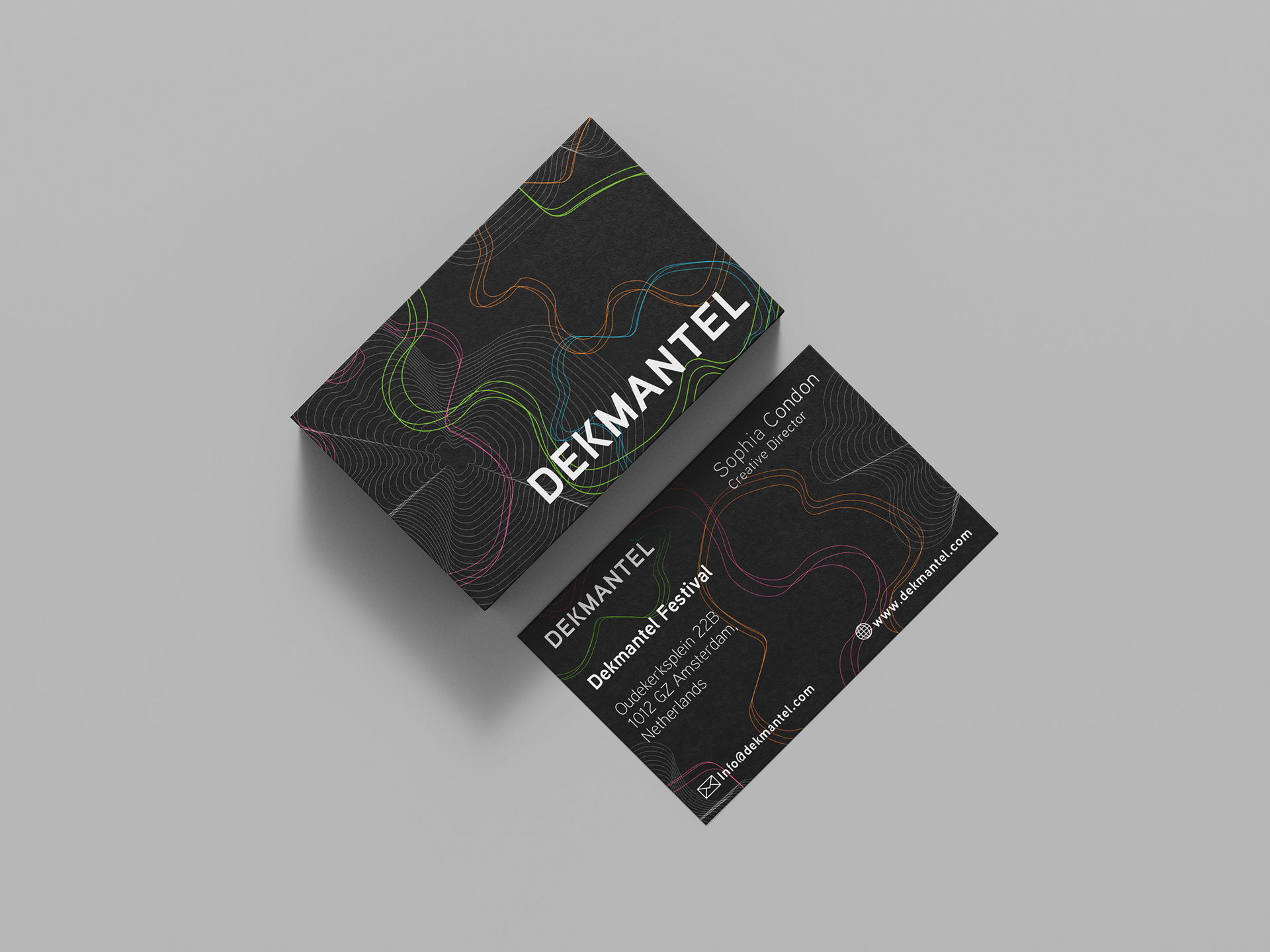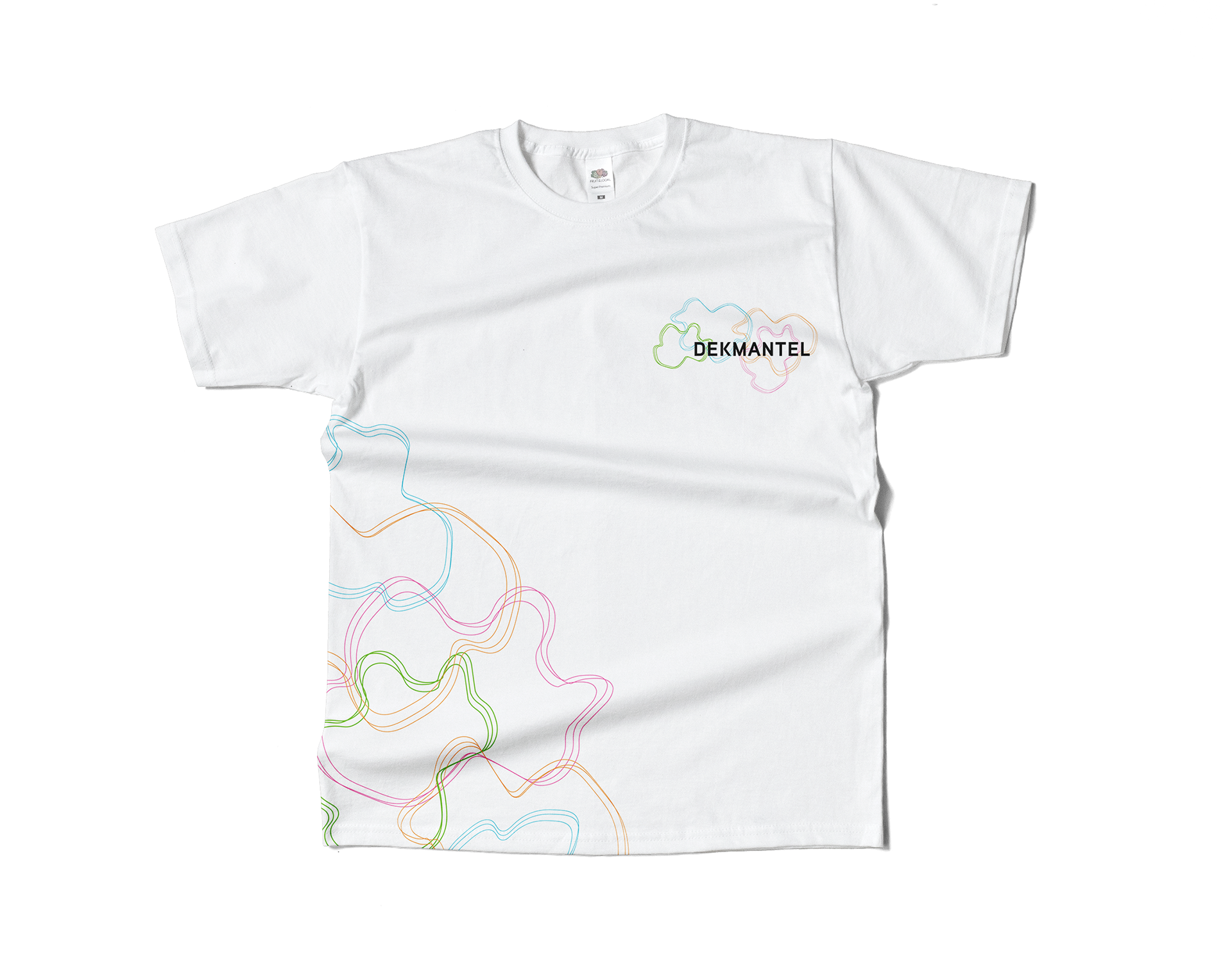

Dekmantels new Identity revolves around a shape that relates to the geographical location of the festival,‘Amsterdamse Bos Forrest’. The logo symbol suggests sound waves moving throughout the crowd of people. The Dekmantel logotype is heavy, loud and unapologetic. This event is a cultural experience, people join a vibey, calm community over the four day festival. By using a vibrant colour palette we brought energy and life back into the branding.